
We got to Savannah yesterday and spent the day checking out the riverfront and then had an awesome dinner at Cotton & Rye. There were many cocktails involved. Today, we got up early, had breakfast and coffee, and then we were off to QuiltCon to see the amazing quilts. Today’s post focuses on some of my favorite quilts. Tomorrow I will share thoughts on the quilting. And Sunday we can chat about the vendor mall. 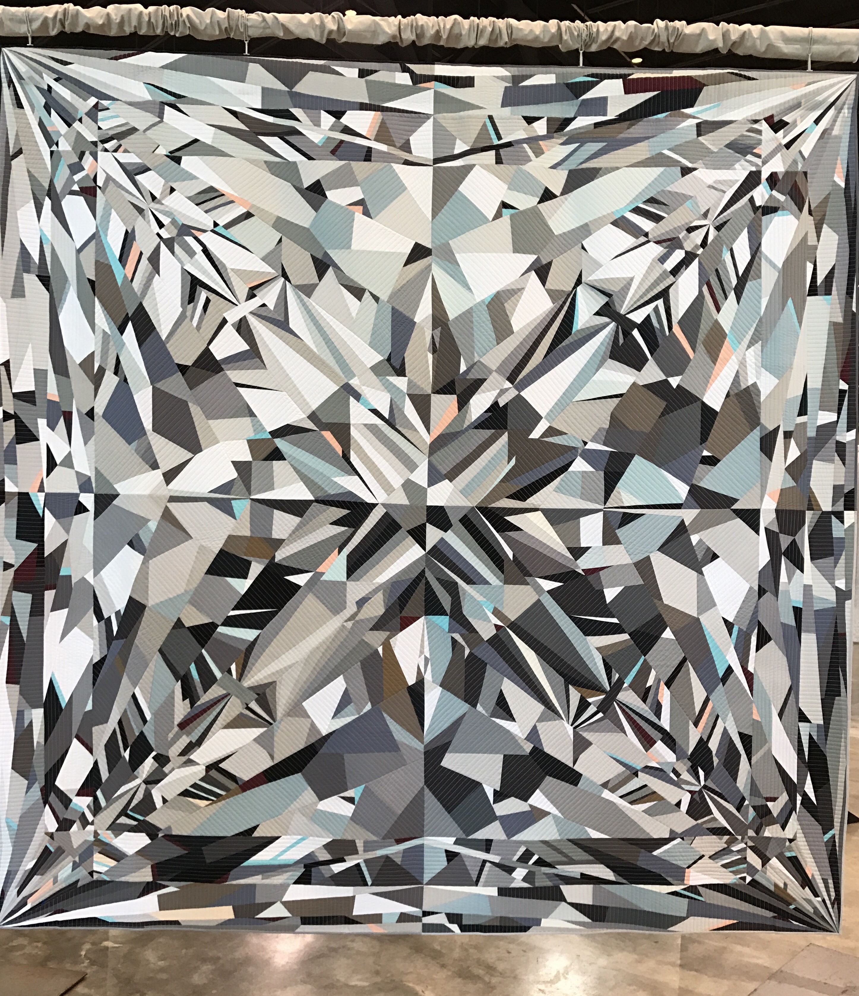
It seems only fair to stay with Katherine Jones’s “Bling,” a beautiful paper pieced diamond. She won Best in Show, and it is quite stunning. This quilt came all the way fro Australia, and you can follow her on Instagram at https://www.instagram.com/twocatsquilts/
Suzanne Pacquette’s bright and cheerful “Pique Nique” is intended to bring you back to a great picnic blanket. I also saw an awesome holiday wrap in this quilt. You can see more at https://www.instagram.com/the_milliner/.

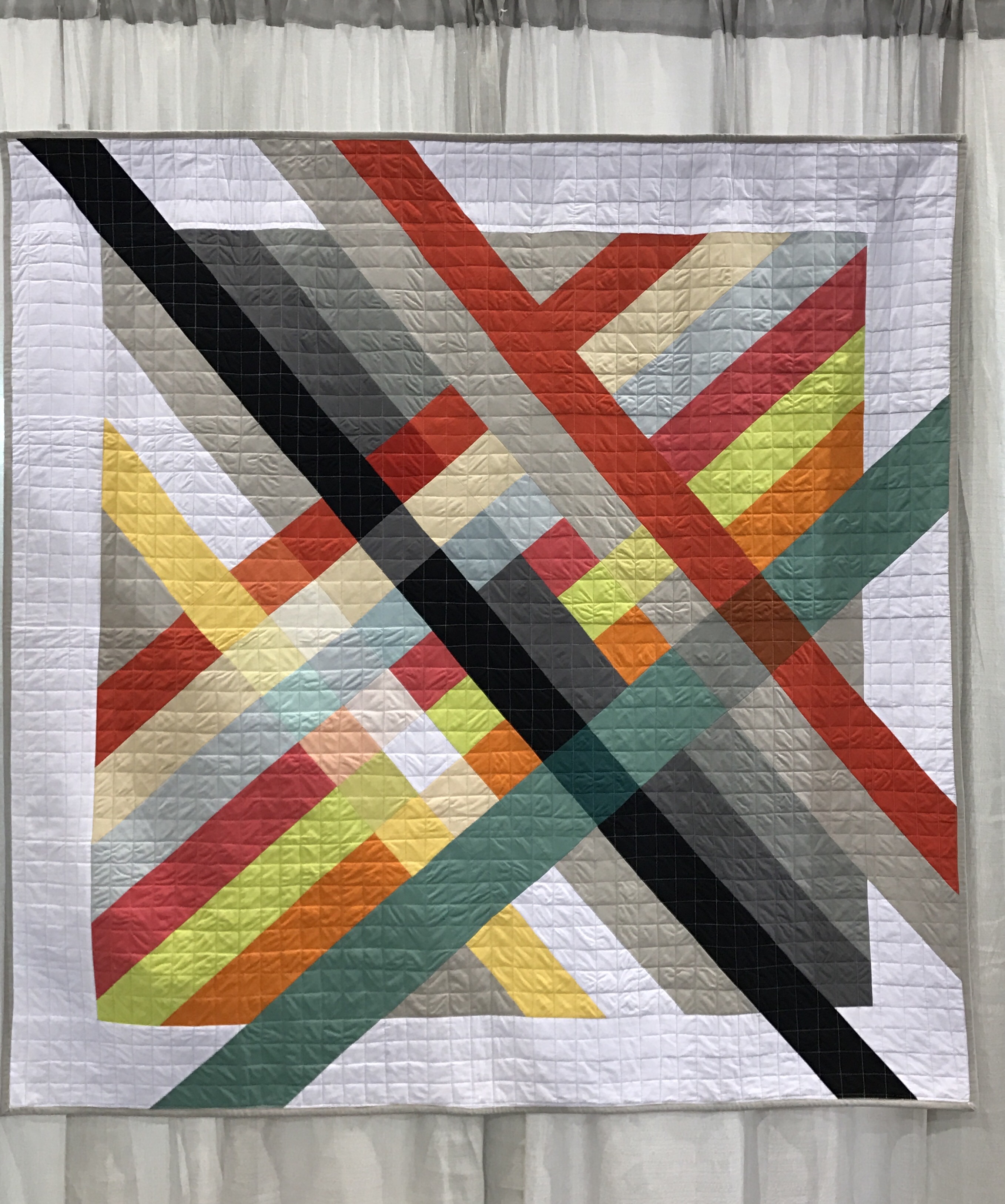
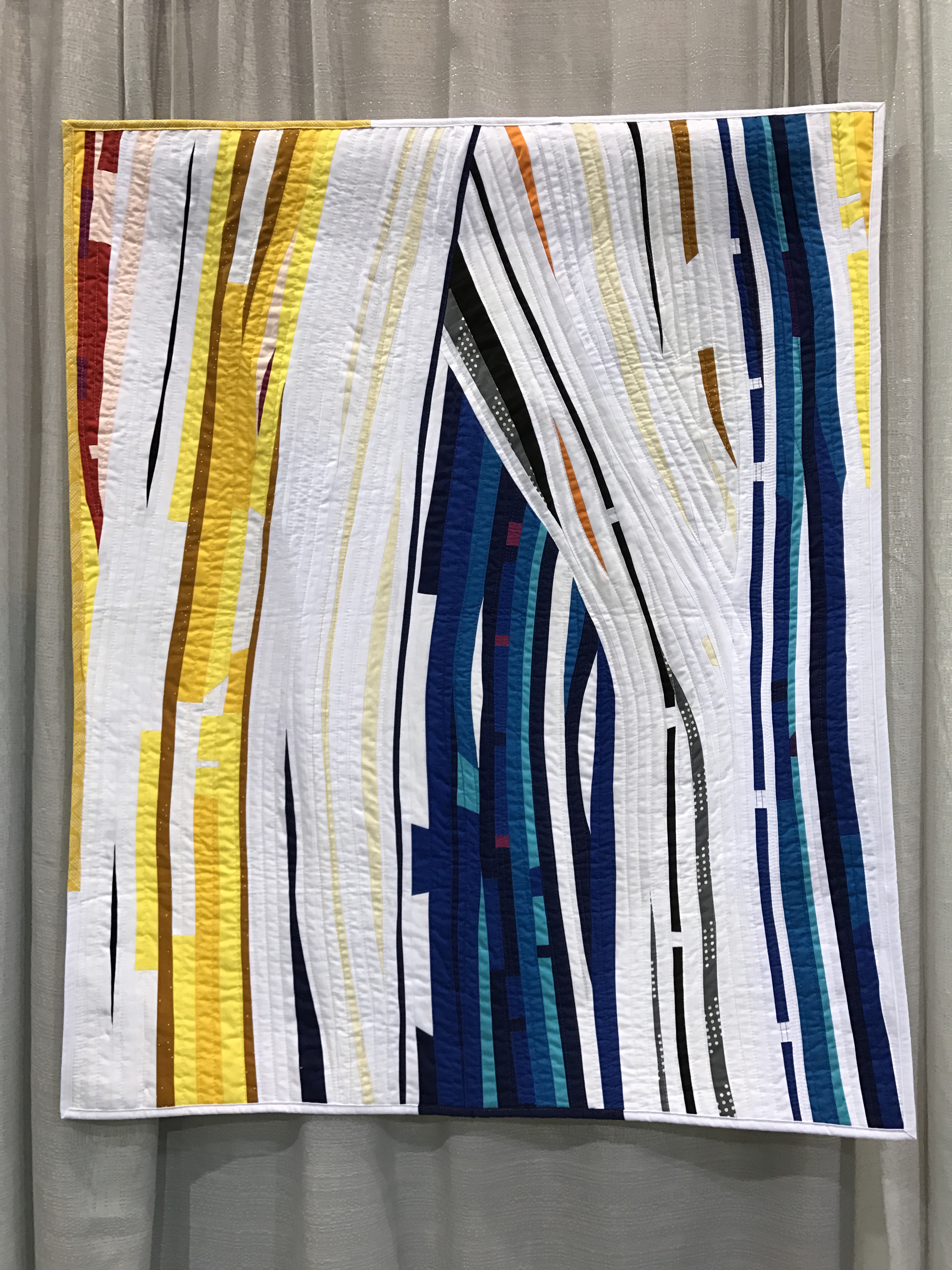
“Warp and Welt,” by Cheryl Brickey of South Carolina was made for the Nine-Patch Challenge. This is quite clever and deserved 1st Place. I love the reinterpretation of the classic nine-patch, the simple palette, and the pop of color with the orange binding. Cheryl’s on Instagram at https://www.instagram.com/meadowmistdesigns/

Kim Soper’s “Lincoln” may be my favorite quilt of the show. She did it without a pattern and the coloring is fabulous. I love seeing these types of quilts and was surprised there weren’t more pop culture quilts as in past years. They don’t make presidents like they used to as I love this. See more at https://www.instagram.com/lelandavestudios/

Every year this is an interpretation of a subway map, and “Gotham Transit Authority,” by Catherine Jarrett is as good as it gets. She even used the quilting to make sure everyone knew which subway system this is. 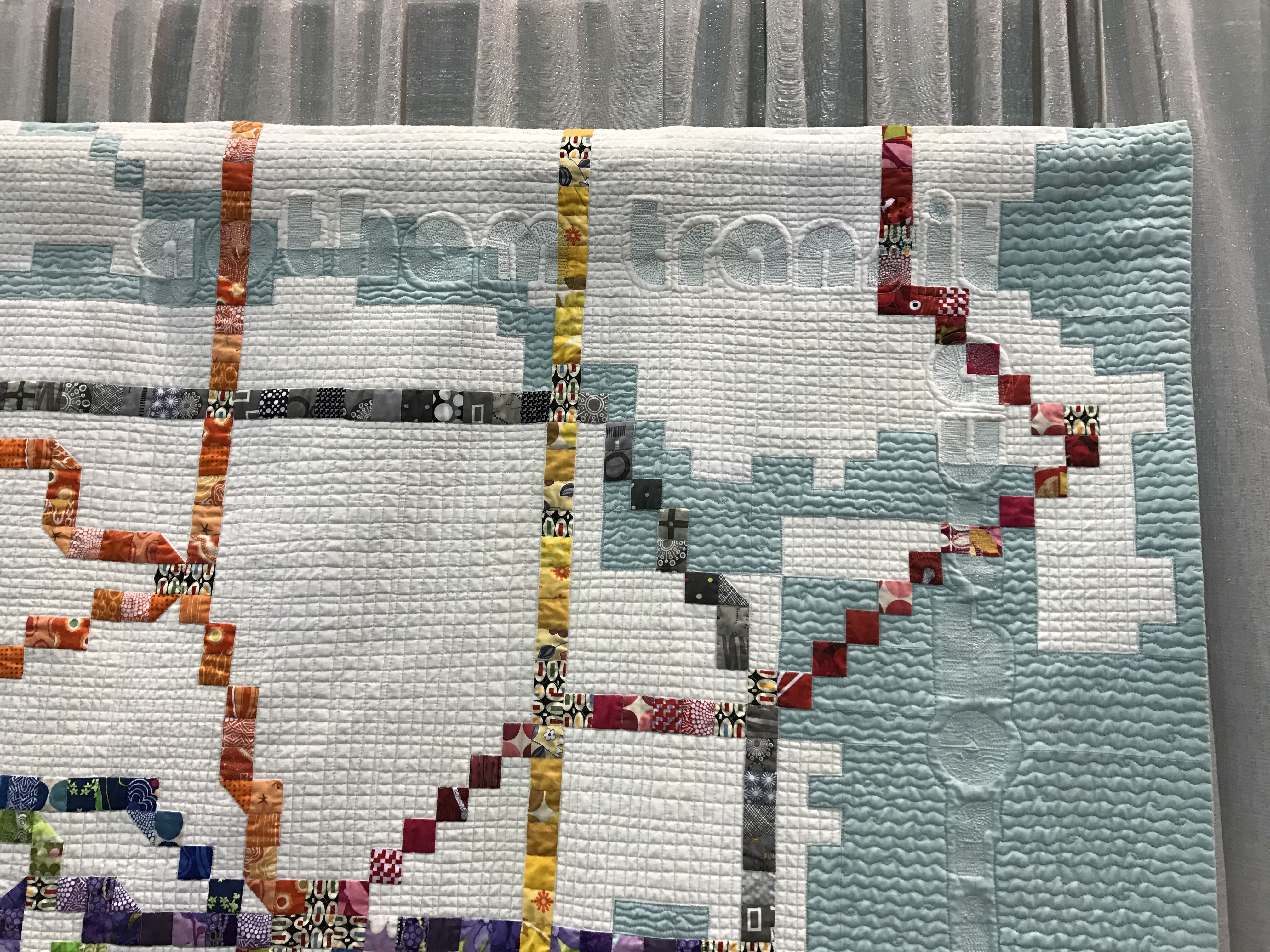
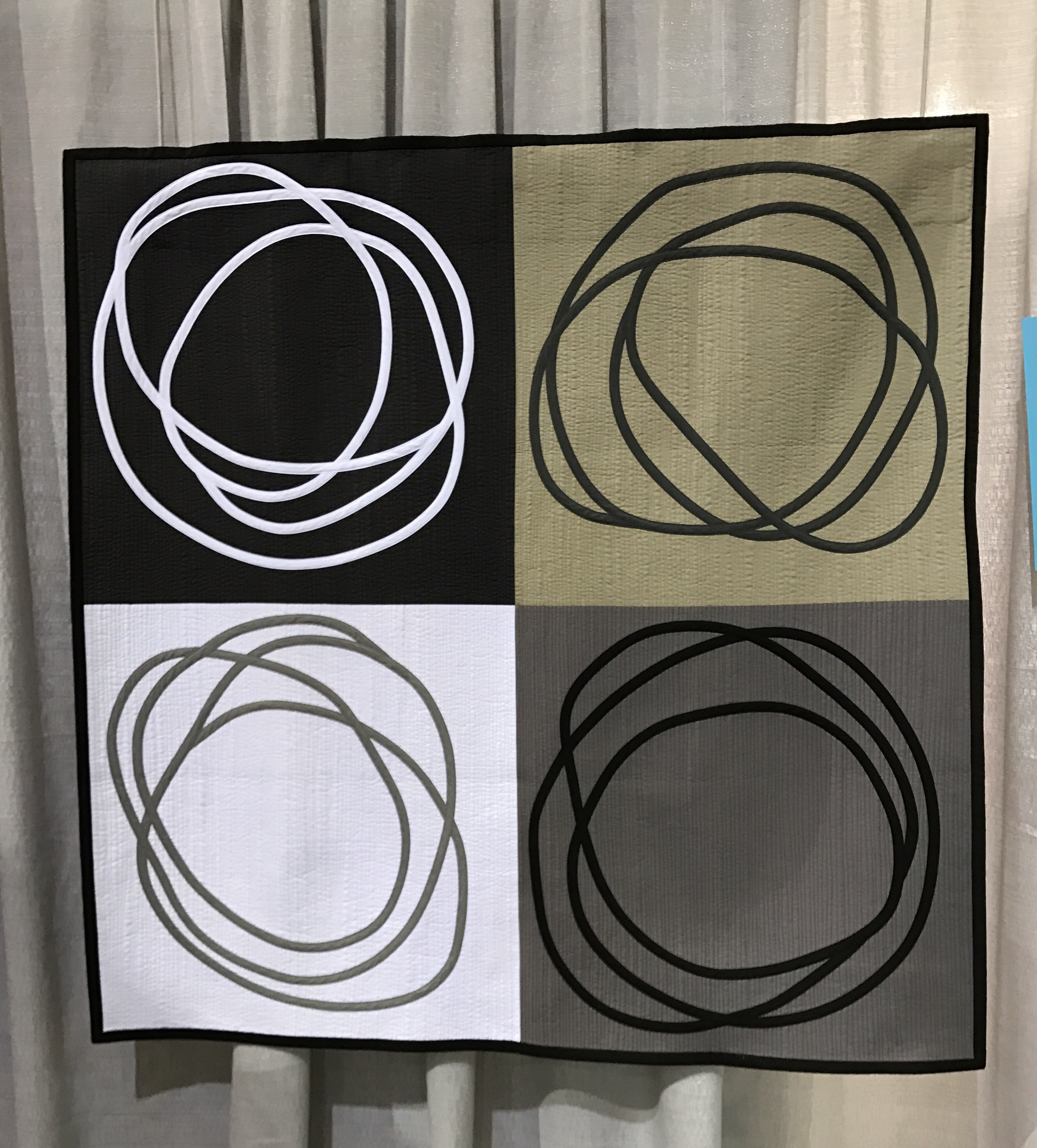
I love the simplicity and bold graphic nature of “Rat’s Nest,” by Diana Vandeyar. It is bias tape appliqué and is stunning. https://www.instagram.com/dianavandeyar
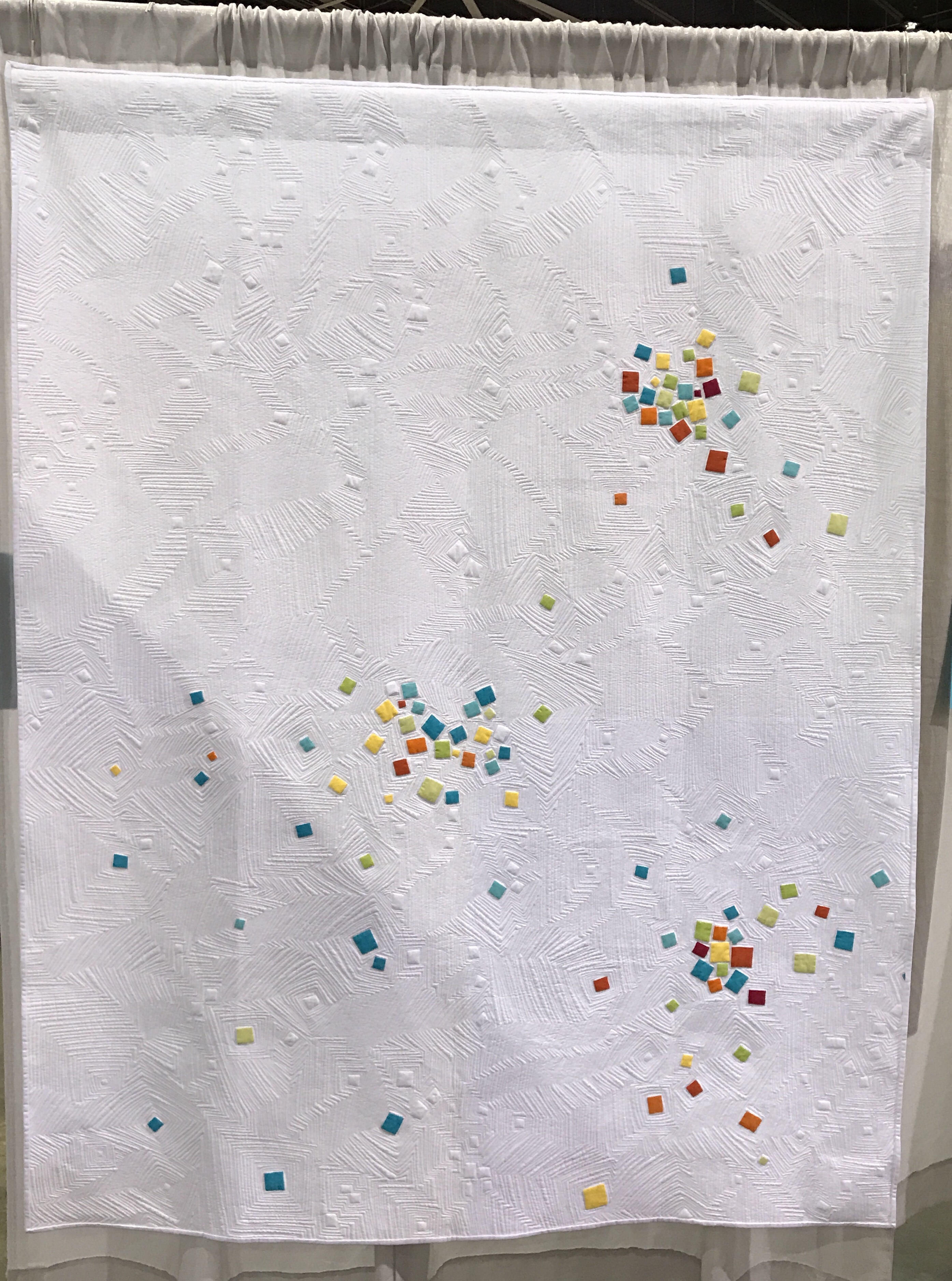
The Minimalist Design category was very strong this year. I really liked “Square Count Game,” by Debra Jarbert of Clermont, Florida. It looks like confetti and is just fun and happy. According to the write up, there are 280 squares on the front. https://www.instagram.com/madeofhonorquilts/
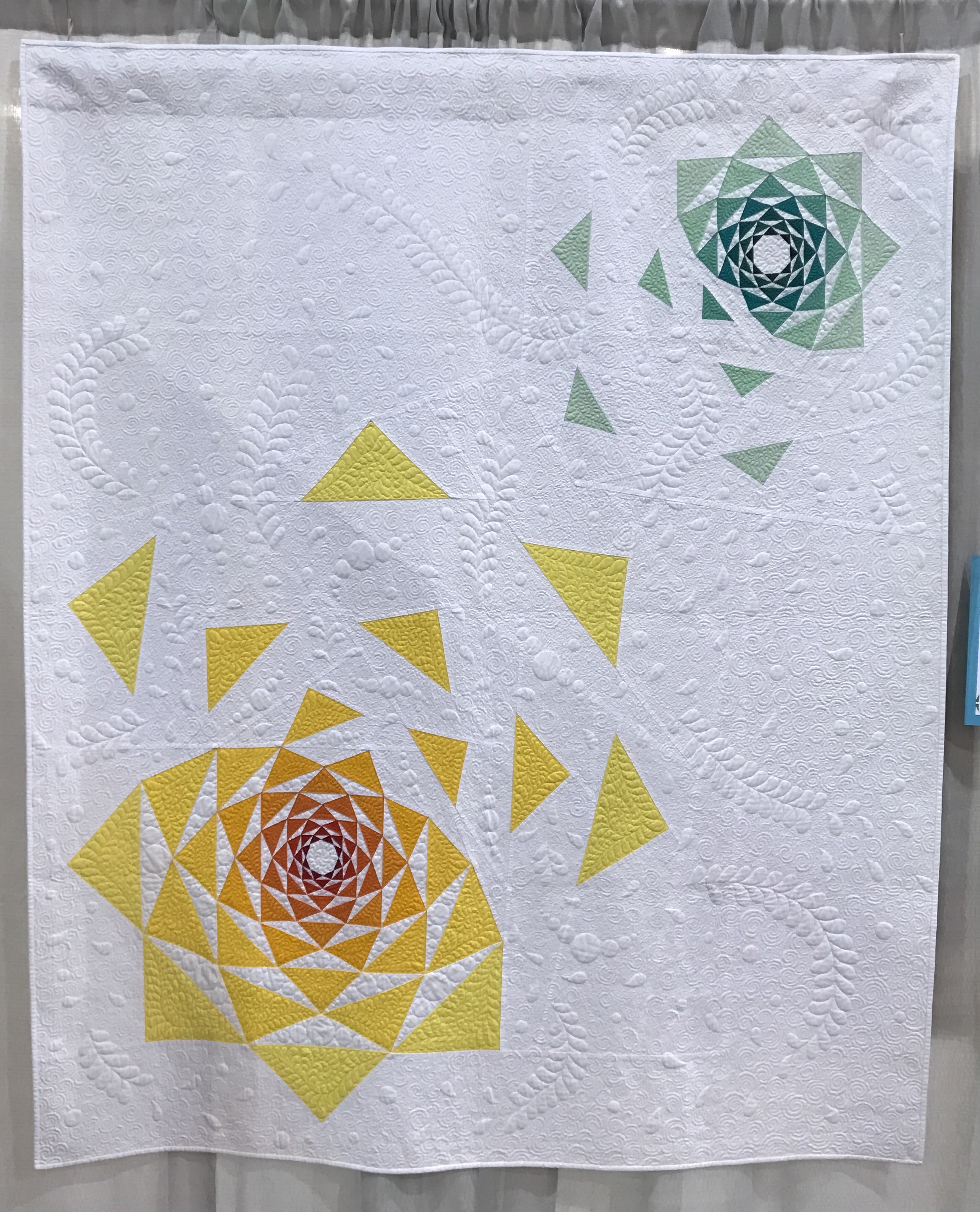
“The Disintegration of the Persistence of Artichokes,” by Sylvia Schaefer of Athens, Georgia is another minimalist quilt I loved. This is actually in the category of Use of Negative Space. She originally designed the artichoke block for a mini and then thought it would be awesome deconstructed. I agree! 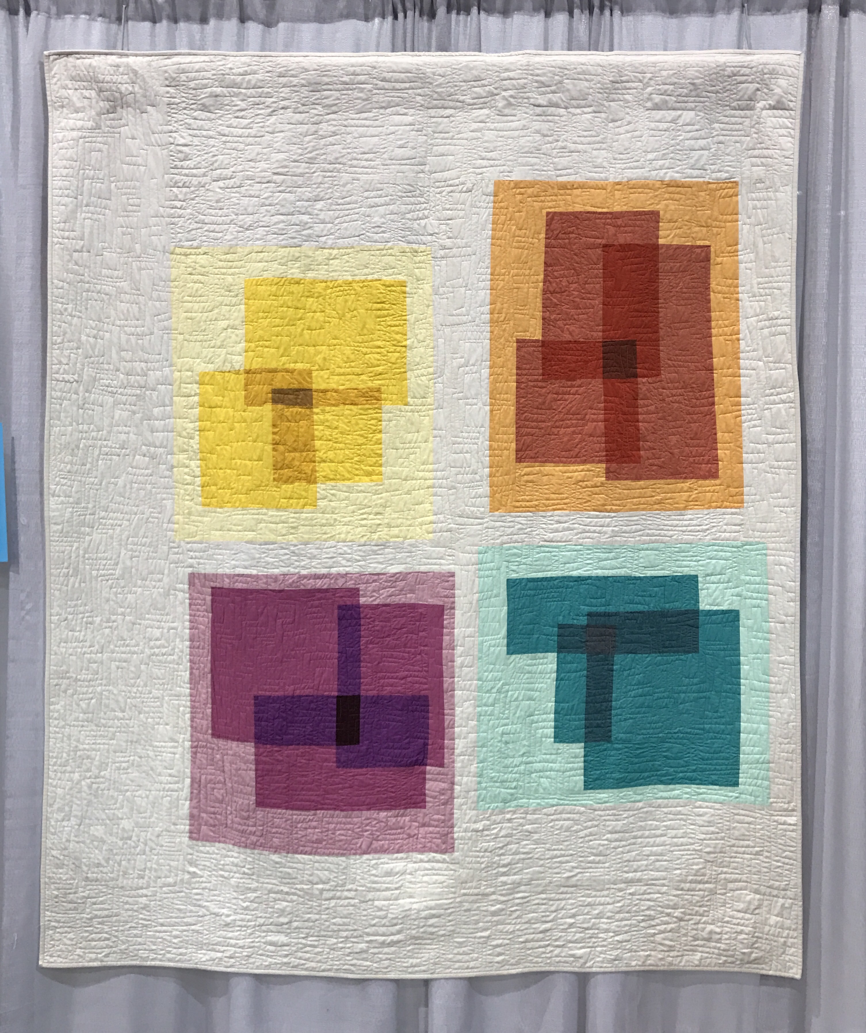
I had heard that there was another quilt that had the same idea as my quilt “Spectrum,” where pieces were arranged to look like overlapping color blocks. “Transparency Squares 1,” by Melissa Everett is beautiful and works well. Entered in the Use of Negative Space Category, it is striking. I love the palette and think she did a beautiful job. 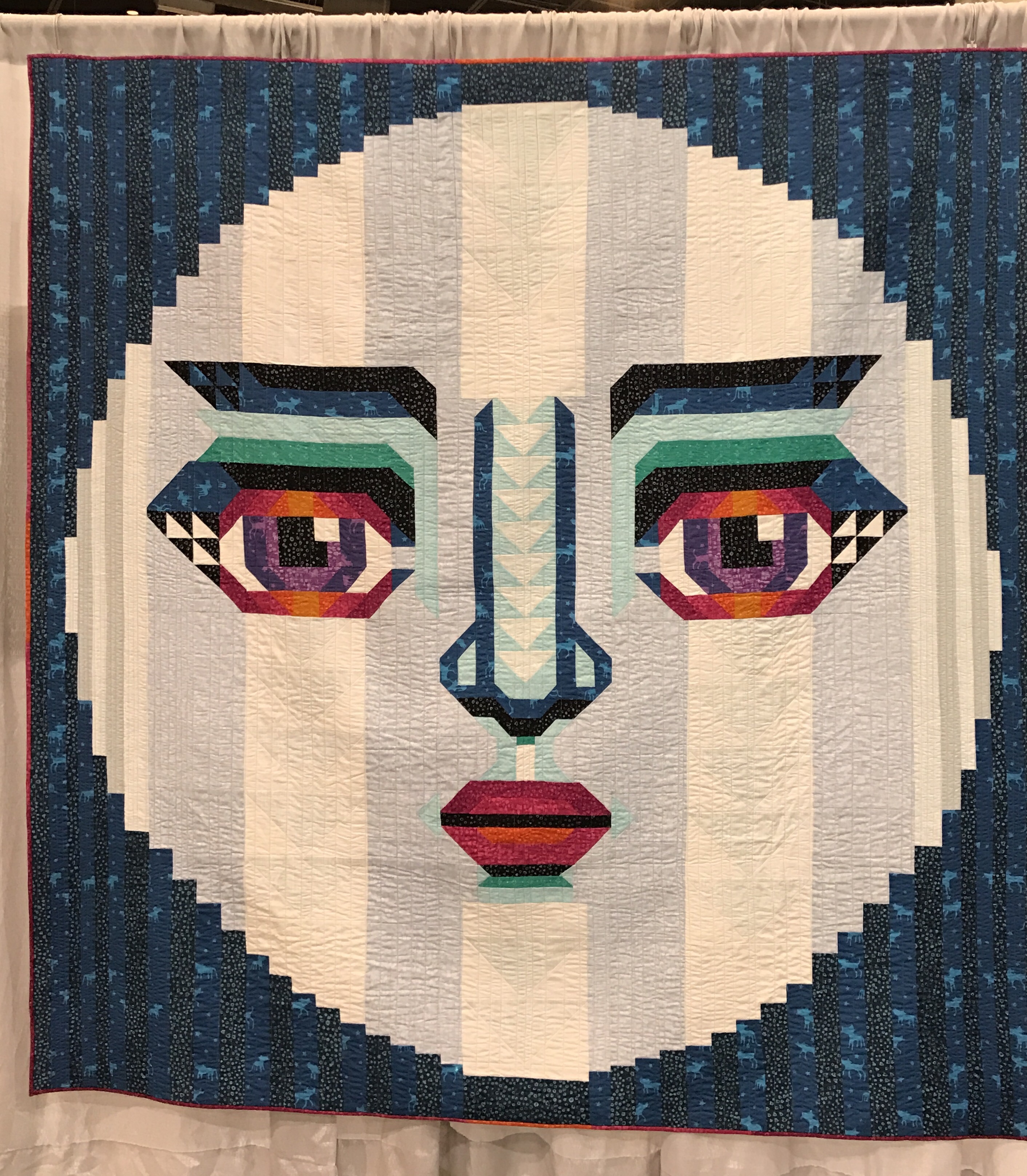
The last quilt I am posting for today is immediately recognizable as a quilt by Melissa Averinos. “Moonie McMoonFace,” is really special and the description is worth reading. 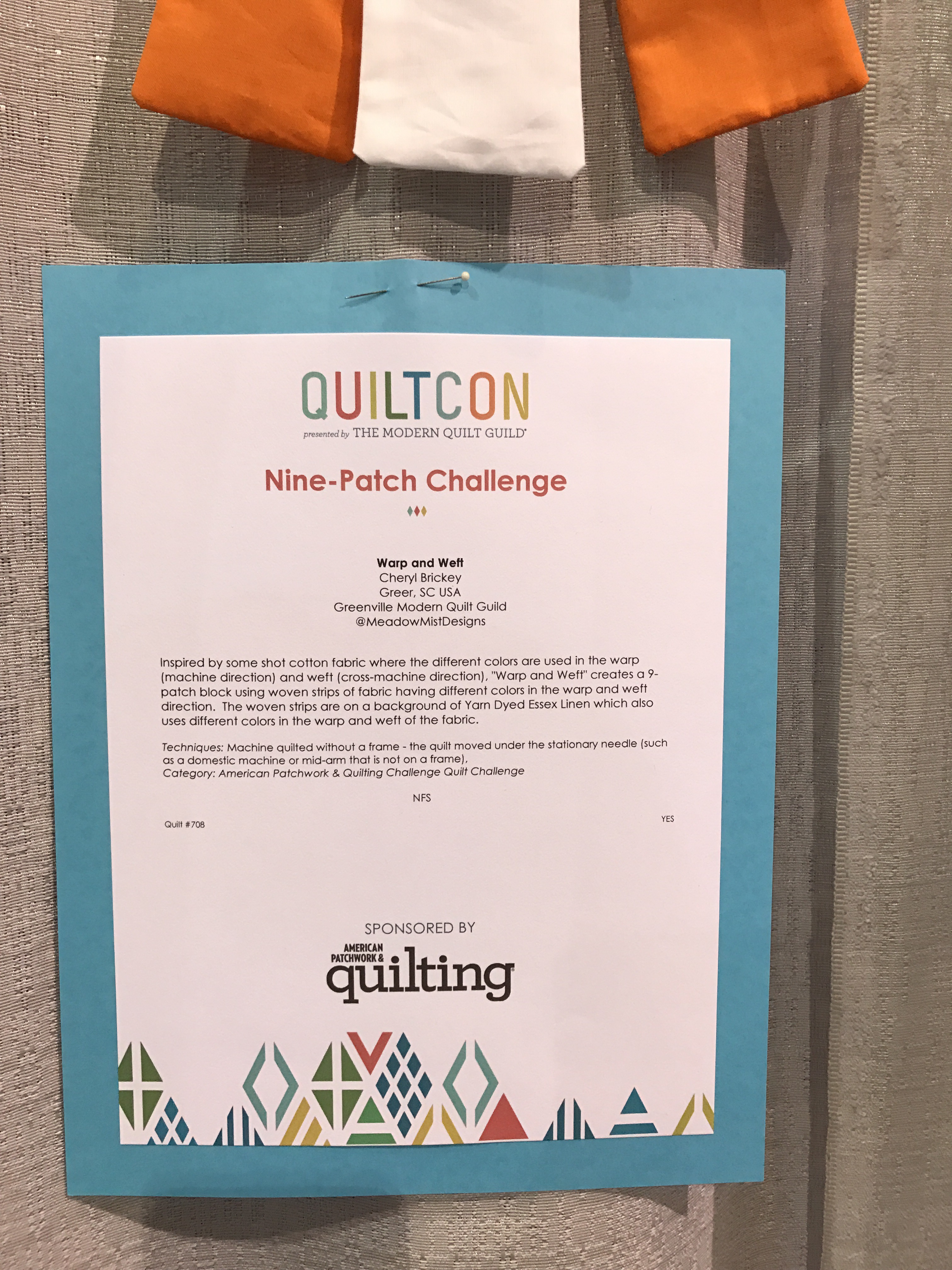
Melissa is a repeat winner at QuiltCon and her Instagram is candy for quilters https://www.instagram.com/melissaaverinos/
The improv category seemed a little weak to me compared to last years. That said, I love “Rails,” by Michelle Wilkie of Cary, North Carolina. She created this based on a photo of a rail yard and I think it is a great representation of improv. See more at https://www.instagram.com/ml_wilkie/
More tomorrow!
